BartDay
  • Economy
    • Business
    • Politics
  • Cryptocurrency
  • Investing
    • Banking
    • Forex
    • Financial Services
  • Markets
    • Capital Markets
    • Emerging Markets
  • People
    • Consumer & Retail
    • Health
    • Opinion
  • Environment
    • Energy
    • Industrials
    • Manufacturing
  • Technology
    • Learning
    • Auto & Transportation
    • Data
    • Science
    • Telecommunications
  • Featured
  • About
BartDay
BartDay
  • Economy
    • Business
    • Politics
  • Cryptocurrency
  • Investing
    • Banking
    • Forex
    • Financial Services
  • Markets
    • Capital Markets
    • Emerging Markets
  • People
    • Consumer & Retail
    • Health
    • Opinion
  • Environment
    • Energy
    • Industrials
    • Manufacturing
  • Technology
    • Learning
    • Auto & Transportation
    • Data
    • Science
    • Telecommunications
  • Featured
  • About

What is a data visualisation?! A predictable pile of digits?

  • October 7, 2023
  • 2 minute read
Total
0
Shares
0
0
0
0

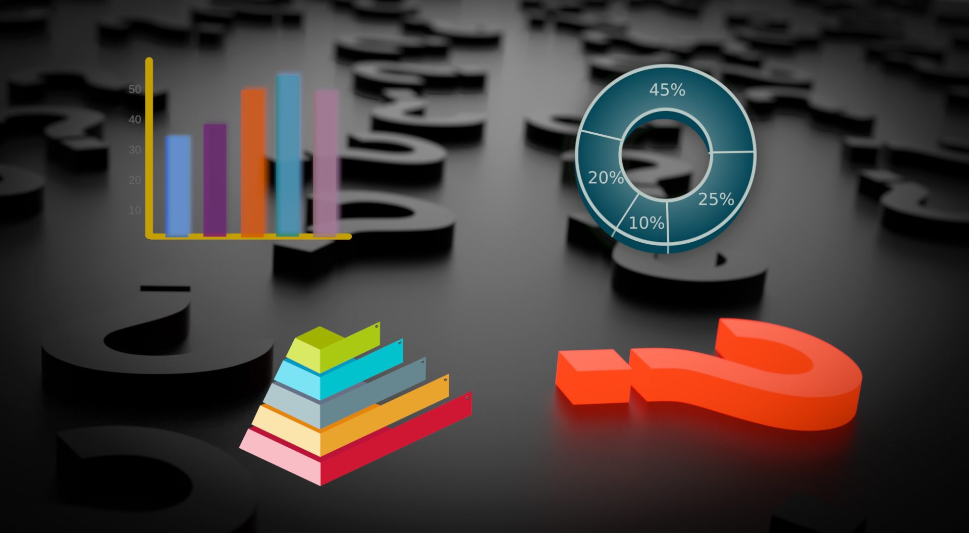
What comes into your mind when you hear or see “Data Visualisation”. It’s probably chart or graphics. That is correct, but that is not all it is.

“Data visualization is the representation of data through use of common graphics, such as charts, plots, infographics, and even animations. These visual displays of information communicate complex data relationships and data-driven insights in a way that is easy to understand.”

IBM

From it’s definition you can already see it’s objective. To make data easier to understand. That is in it’s essence, the purpose of why we make data visualisation. Here have some key points to consider when making a data visualistion


Partner with bartday.com. Kindly head here.


From our partners:

CITI.IO :: Business. Institutions. Society. Global Political Economy.
CYBERPOGO.COM :: For the Arts, Sciences, and Technology.
DADAHACKS.COM :: Parenting For The Rest Of Us.
ZEDISTA.COM :: Entertainment. Sports. Culture. Escape.
TAKUMAKU.COM :: For The Hearth And Home.
ASTER.CLOUD :: From The Cloud And Beyond.
LIWAIWAI.COM :: Intelligence, Inside and Outside.
GLOBALCLOUDPLATFORMS.COM :: For The World's Computing Needs.
FIREGULAMAN.COM :: For The Fire In The Belly Of The Coder.
ASTERCASTER.COM :: Supra Astra. Beyond The Stars.
BARTDAY.COM :: Prosperity For Everyone.


What is the nature of your data?

The nature of the data is important. It usually is a collection of records taken within a period of time. It could be a daily transaction or sales of a grocery, the number of times you have eaten in a specific restaurant, or one of the most common sources and use of data is stocks. By default even without creating a graphics your data will already show something. Now it is up to you to make use of it.

What you want the audience to understand?

Now that you have a source of data, you need to identify what your audience need to realise after seeing your visualisation. One thing to make it easier is that your design should make it easier and faster to understand your point when comparing it when they are just given the data plainly. If they did not understood the purpose of the graphical representation then it can be considered a failure and should reconsider a redesign.

Showing it to someone and asking for opinion is a good start. It might be hard at first to do this yourself, as there may be some bias. But in the future, you should be able to switch to a different perspective or even a persona when looking at your own design. Somewhere along the line “If I were this type of person who does not know anything about this line of work and see this, what would I realise or understand from it?”

What you really want to say?

If you have created a visualisation that makes people understood the visusalisation, you can safely say that you have created something to look at too. Your audience might be everyone specially when publish publicly. But it could also be a team in your company.

With this in mind, have you conveyed what your objective is for this graphics. It’s also possible that it can be misunderstood to look at. An example is that you have created a chart that shows the sales of your product. Instead of showing that the sales have been decreasing due to lack of marketing, it was blamed on the engineering or production team.

Remember that data can be misinterpreted. It can even be manipulated. What you convey depends on how you represent the data.

John Francis

Related Topics
  • Data
  • Data visualisation
  • Design
  • Graphics
You May Also Like
Cloud platforms among the clouds
Read More
  • 2 min
  • Learning
  • Technology

Best Cloud Platforms Offering Free Trials for Cloud Mastery

  • December 23, 2024
Crab
Read More
  • 2 min
  • Gears
  • Learning
  • Technology

The Best Friends for a Rustacean. Top Books in Learning Rust.

  • August 25, 2024
Read More
  • 2 min
  • Learning

ABC’s of the Linux Nano Editor.

  • October 10, 2023
Read More
  • 2 min
  • Data
  • Learning

Resources to Take Your Charts From Bland to Beautiful

  • September 6, 2023
Dog with glasses using a tablet
Read More
  • 3 min
  • Learning

More Than Math – The Must-Have Non-Technical Skills for Data Pros

  • August 18, 2023
Laptop and spreadsheet
Read More
  • 1 min
  • Learning

Simple Things That Are Good To Know In Google Spreadsheets

  • August 13, 2023
People using on laptop
Read More
  • 2 min
  • Learning

Increase Productivity With These Simple Tips

  • August 12, 2023
generative-ai-google-deepmind-lISkvdgfLEk-unsplash
Read More
  • 2 min
  • Featured
  • Learning
  • Technology

How Generative AI Provides Opportunities For Jobs And Creativity

  • August 8, 2023
  • The Summer Adventures : Hiking and Nature Walks Essentials
    • June 2, 2025
  • Gemma 3n
    Announcing Gemma 3n preview: powerful, efficient, mobile-first AI
    • May 22, 2025
  • oracle-ibm
    Google Cloud and Philips Collaborate to Drive Consumer Marketing Innovation and Transform Digital Asset Management with AI
    • May 20, 2025
  • college-of-cardinals-2025
    The Definitive Who’s Who of the 2025 Papal Conclave
    • May 7, 2025
  • conclave-poster-black-smoke
    The World Is Revalidating Itself
    • May 6, 2025
about
Unleash Your Financial Potential With Us

BartDay is your all-in source of information for market insights, finance news, investing, trading, and more.

Data and information is provided “as is”. BartDay and any of its information service providers or third party sources is not liable for loss of revenues or profits and damages.

For comments, suggestions, or sponsorships, you may reach us at [email protected]
  • 1
    The Summer Adventures : Hiking and Nature Walks Essentials
    • June 2, 2025
  • Gemma 3n 2
    Announcing Gemma 3n preview: powerful, efficient, mobile-first AI
    • May 22, 2025
  • oracle-ibm 3
    Google Cloud and Philips Collaborate to Drive Consumer Marketing Innovation and Transform Digital Asset Management with AI
    • May 20, 2025
  • college-of-cardinals-2025 4
    The Definitive Who’s Who of the 2025 Papal Conclave
    • May 7, 2025
  • conclave-poster-black-smoke 5
    The World Is Revalidating Itself
    • May 6, 2025
BartDay
  • Economy
  • Cryptocurrency
  • Investing
  • Markets
  • People
  • Environment
  • Technology
  • Featured
  • About
Unleash Your Financial Potential With Us

Input your search keywords and press Enter.